The rate I'm working at, that is. I did finish a scene today tho, and it's short and innocuous enough to show without spoiling the story! Trust me, it's got almost nothing to do with the rest of the film.

Showing posts with label Animation. Show all posts
Showing posts with label Animation. Show all posts
Monday, February 24, 2014

Wednesday, February 5, 2014
Keeping Things Updated
Haven't seen the sun in a couple of days. That just means I'm being productive tho, right?
In any case, here's a clip from the film I'm working on! I don't think I've actually done this much animating since the end of third year. Not exactly a model animation student, see.
More stuff...soon.
Friday, December 20, 2013

Thursday, April 4, 2013
D:
 |
| How I feel right now. |
Chuggin' along....
Chuggin' along. There's no context to this animation at all. It doesn't really make sense in sequence either, to be honest. It's missing like two layers of character animation.
-
I misplaced my sanity somewhere today, but the cintiq light had burned the focus out of my eyes and I couldn't find it again. I asked everyone else if they had my sanity, but they were too busy looking for their own. Such is third year.
Tuesday, April 2, 2013
Sunday, October 2, 2011
But For Me, It Was Tuesday

So when I was about half way through this painting, it occurred to me that being depicted as a Merman With Wings (TM) was not exactly the kind of thing that floats people's boats. In fact, if I was to hazard a guess, I would say that witnessing one's image being distorted in such a manner would likely attribute to their boat being met with an earlier and possibly more devastating end. Functionally, this painting has more in common with your average high yield nautical explosive than any form of caricature. I got the idea from a conversion in our Tuesday Pound Resign Texture, and that's all I've got on the subject.


Yeah, and once again, all these sketches are from Thursday, which seems to be the only day that I can clock in consecutive hours of sketching time. I don't think I even touch my sketchbook on any other day. I meant to have two more paintings ready for this post, but with schoolwork being what it is, both of those paintings currently have about as much form and compositional clarity as a tiled roof covered in pigeon crap...or a Pollock painting (ZING!).
And then there's this. I messed up a lot of the timing towards the end, and went really lax with detailing the splashes. The entire cycle is, on twos, barely two seconds long, which means everything feels rushed. Some of the motion keys don't read at all, and the entire sequence leading from the splash to the repeat is just sloppy as all hell, with all kinds of weird distortions. I wish I had more time to work out the timing issues, but really, c'est la vie.
Saturday, April 23, 2011
I DEMAND TO SEE LIFE'S MANAGER

I've got too many lemons, and I can't hold them all! In all seriousness though, that must have been the best 10 hours of my life ever spent in front of a screen. Did you know that even with meticulous attention to the tiniest of details, we still managed to miss the [spoiler]s on the [spoiler] displays?! Preposterous!
Anyway, this perfectly describes my sentiment towards a year of art education (Actual ART education, wouldjabelieveit?! And a year of it too!). I still regret that Oakville is not a Neo-Liberal enclave of rebellious artists from around the globe under the canopy of a futuristic metropolis, but you can't have everything. If it just had a canal of raw sewage running through it...

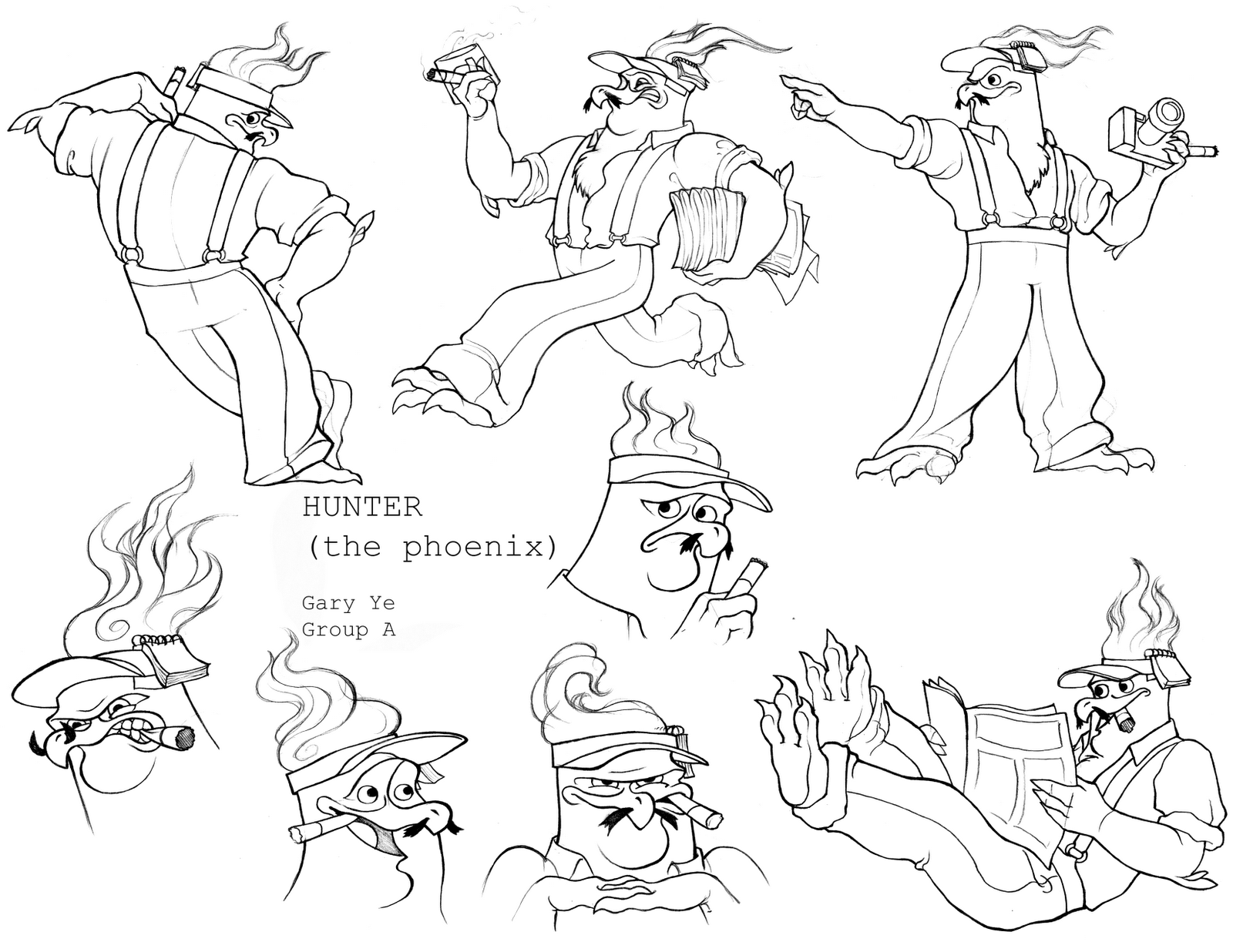
I've got a lot of backlogged work from this semester, but because I haven't had anything particularly important to muse myself with (Each post is like writing a diary entry in a notebook of madness), I haven't posted them. Above is the last character design assignment of the year. I'm still not really sure as to how one judges a character, so I won't try to get too deeply into it. It's supposed to be a phoenix, you see. I just picked the name of my favorite journalist to name the character. He was real close to being called Weegee.
This entire year, I've apparently made only male characters, so my summer resolution is to practice drawing hourglasses.


And here's something I've forgotten to post. The assignment was to draw some kind of anatomical reference with illustrations and captions. I'm not sure, I didn't read the assignment sheet. This is what I ended up with, though, and I gotta tell ya, it's not doing so much for my chances in the comic industry. There were 6 pages, but to be honest, the extra cheesy dialogue starts being plagued with typos in the 4th page, and the art spirals into oblivion on the fifth. I've saved any perusing eyes the torture.
It really is extra cheesy. Like a 6 topping pizza, except all the toppings are cheese. Or the moon.
Oh yeah, and I did animation too. It follows my philosophy of starting out lukewarm and then quickly contracting a fine layer of moss. The animation quality goes from sorta decent to not enough coffee after the repeat holds. The sack itself is supposed to be doing a Billie Jean hip thrust, but as a classmate cleverly pointed out, a gelatinous mass cannot hip thrust. Looks like I've got some real issues to iron out over the summer. Live and learn and trudge on through and so forth.
Regarding the entire year though, it's been an experience, to say the least. Cool People in Cool Situations: The Movie is what it was. Ratings weren't that great though, especially from the sleeping a consistent 8 hour per night camp.
Sunday, March 27, 2011
Everybody's Got the Blues

The light tables' are glowin'
*Duh dun duh dun nah*
The pencils are scratchin'
*Duh dun duh dun nah*
The people are slavin'~~~~~
Doin' their animal walk
*Duh dun duh dun nah*
We all got the blues
*Duh dun duh dun nah*
Animation blues
We all got the blues
*Duh dun duh dun nah*
Animation blues
I just really need to do something unrelated to painting and animation right now. There's a human threshold for painting and animating and I am clearly approaching it. So instead of playing STALKER and wasting the rest of the night, I have decided to do a little bit of updating on this, my oh so neglected blog.
I've done a lot of stuff over the past few weeks, but very little that I would actually call presentable. In fact, some of the stuff I'm posting actually sucks, but I'm putting them up in the hopes that when I look back upon this moment years from now, I can remember how MUCH it sucks. Officially. For perspective purposes.
I've included the age sequence assignment from character design. Some bits look wonky, and the silhouette for the infant stage is awful. Could've had a better color scheme too, I guess, but that's attached to a cinder block in the water under the bridge now.


And, some layouts. Top is the texture assignment (I know there's no texture), and bottom is the big small assignment. I post these now, because as soon as I get a chance to do it, I'm going to repaint/rework them (but I'm not in a hurry, given that all the grades are already in and aren't liable to change). I'm not proud of the execution of either, but they pad up the post real well, don't they? Why, they must almost occupy nearly 1/4 of the screen! Blimey!
I just finished the roughest gorilla walk cycle ever conceived by mortals. I'd rather not talk about it. If any expert wants to conduct a study on PTSD and its relation to animation students, here's your chance.
And finally, my greatest failure this semester.
It's not that I couldn't make it look good, it's that I didn't have the grit to make it look good. They say grit could make or break a man. If you ain't got it, chances aren't too good of you seeing many more sunrises. My eyes strained under the eggshell white glow of the animation table. I found myself trapped, between a peg bar and a hard place. Not enough patience to fix the problems, not enough energy to correct the imperfections. It was just one last speed bump before the light at the end of the tunnel, some small, insignificant jostle that didn't have to be any more than that. It was practically begging to be driven over, without a care, like the carcass of some small animal whose only reason for being is to add gristle to the road. It was beckoning, almost enticingly so, to be glossed over, to be buried by the highway and lost from memory. I'd never heard of a schmuck that wanted to make life difficult for himself, not in this business. I wasn't about to be the first.
I'm certainly going to redo this, sometime over the summer, I expect.
And now, with an escalating sense of dread, I am compelled to return to painting.
Saturday, February 26, 2011
Rose Cougar

A spectre is haunting my reading week- the spectre of animation.
Man, this semester has not been agreeable with my health at all. I have come to the conclusion that having paintings and animations due consecutively AND concurrently is the most sinister expression of physical and mental torment ever conceived. Right up there with pitchforks, boiling cauldrons, and appendectomies.
I have a lot of stuff accumulated from this semester that I'll get to posting eventually, this Pink Panther animation being one of them. It noticeably hiccups at two separate points, so I guess I'll need to fix that. The other stuff kind of looks like what haggis sounds like, but without the "savory, nutty flavour".
I still have an infuriatingly long way to go, and pertaining to the length of said journey, I so mad it's ridiculous.
Saturday, December 4, 2010
0.25% Of Total Content Released
After an entire day's work on this thing (Don't you just love the noise gradient Flipbook puts onto everything? I do) I am glad that, in the foreseeable future, I shall not have to animate anything even remotely spherical again. I also never want to eat pie again (EH? EH?)
This is a pencil test of the rough (to emphasize this, I've not bothered to render the video in any quality beyond the Flipbook minimum. 480p to see lines) animation for the Ball and Tail assignment. I had some actions planned beforehand (who says I didn't do a dope sheet? I do dope sheets ALL the time. BUSHELS of them, whole TREES of them, FORESTS of them, a dense canopy of dope sheets that blot out the day's light!). However, as I decided to add new things, most of those plans were invalidated. I'll need to fix the arc of motion for all bounces, since they are obviously ALL too fast. It is rough, but I have another week to work on it. I only post it now because I feel obligated to post something every week as a matter of course, and since I don't have anything else to post this week...
I was going to animate a real animal tail, but I ended up making it look more like a leaf. Seeing as how it's on a curved hill, the temptation was too much to resist. Hence the little bit you see at the end.
I really did run out of paper. Need to get more tomorrow. Also broke a peg bar. [REDACTED].
Saturday, November 6, 2010
Baals
I've also decided to pad my post count with animations from this year. I heard if you get up to 1000 posts, a genie arrives at your doorstep with an offer to grant your greatest desire! (Or a letter of acceptance from Hogwarts!).Only the Bouncing Baal has the background from Digital Tools, though. Uh, I did the Baaloon freehand, before I knew about The Key Frames, so it looks sort of shoddy. That's why it's in my Recycle Bin, and not an object of public Schadenfreude.
I Want To Believe

I got rid of the hazy shapes in the back, so that there's more open ocean. Got rid of the weird looking smoke, and added another statue to help the emptiness.
Subscribe to:
Posts (Atom)